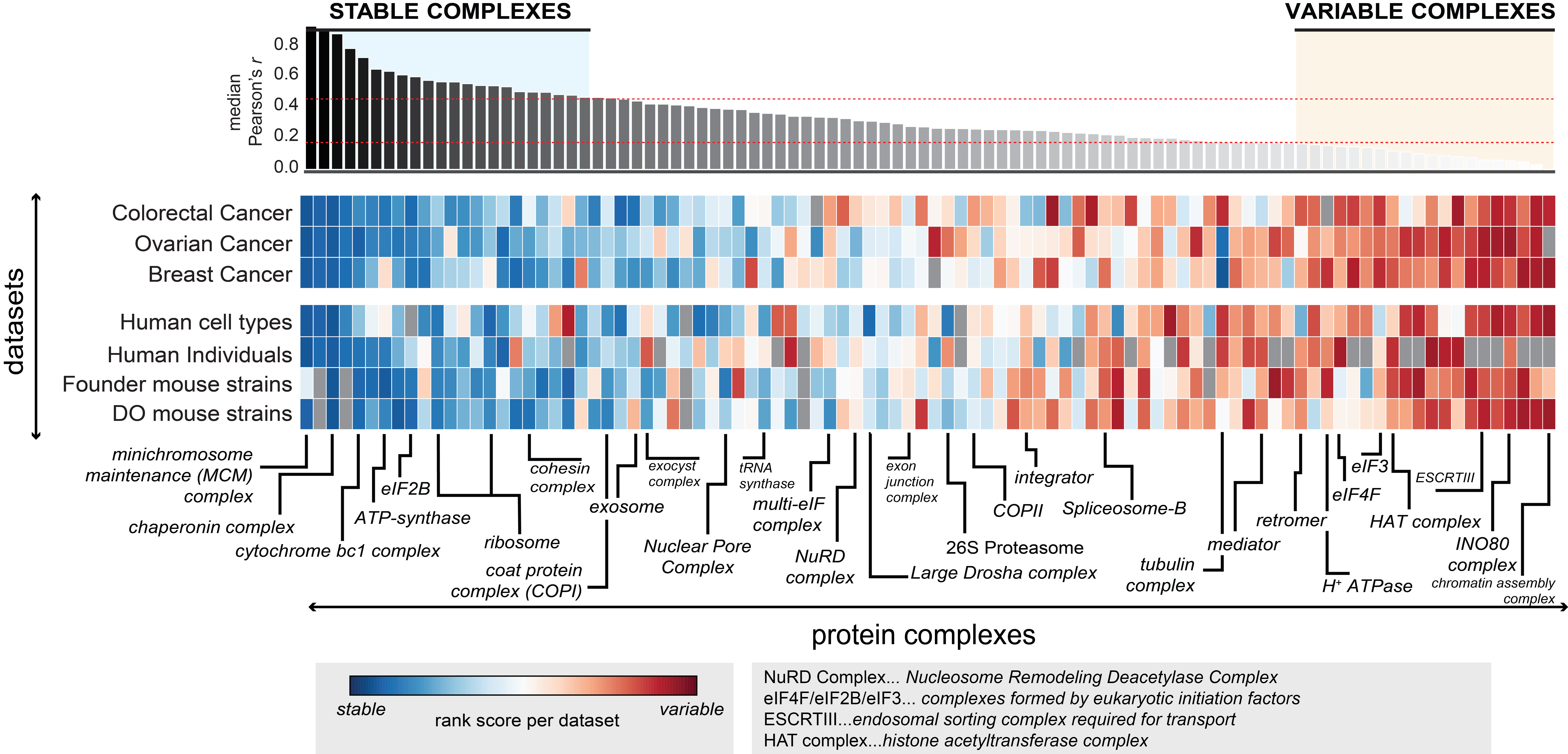
Figure 3
Manually curated complexes are shown on the x-axis, and are sorted according to the median co-abundance observed of complex members in different datasets considered (y-axis). Of the original datasets analyzed in Figure 2, the top 6 proteomic datasets that were the best at recovering known functional modules and ‘Human cell types’ (used as reference, Geiger et al., 2012) are shown. In each dataset median co-abundance of each complex is calculated and ranked. The heatmap illustrates those ranked variable, ranging from variable complexes (red) to stable complexes (blue). The top stable and top variable complexes are defined as the respective quantiles (top 25%, variable complexes; bottom 25%, stable complexes). Selected protein complexes are indicated, in some cases using complex name abbreviations as explained in the respective legend. Details on the protein members of each complex are given in Table S3.
This figure has been generated with the following code: figure3_code
The underlying data can be found here.
